Search in documentation
ThisPlugin manager – Global colors
Global Colors as a feature of the Thisplugin manager is a great tool for creating and managing all the colors you need for your website (including colors for our plugins).
It allows you to generate all the colors from just your brand color in just a few clicks. You can choose from several ways to generate color combinations and, of course, customize the generated combinations. You can easily add the obtained colors to the block editor and color picker, including the ability to adjust the order of displaying colors in color palettes. Thanks to variables and classes you can easily use colors in CSS.
In addition, the tool allows you to easily export and import colors between different web projects. And if the acquired colors are not enough for you, you can use our free Custom Colors addon and add additional accents and their shades.
Color generator
The Color Generator will help you generate all the colors you need for your website. All based on a single, usually brand color. Just choose the number of accents you want to use on the website (usually one or two) and the method of color generation.
Depending on the number of accents selected, you have the following options:
1. Brand color and 1 accent:
- analogous colors
- complementary colors
2. Mark and 2 accents:
- split complementary colors
- analogous colors
- triadic colors
You can read more about individual options for generating color combinations in our article. Our generator makes full use of the color wheel options.
After you select the base color for which you want to find suitable color combinations, the generator will automatically generate the preferred options. You can also fine-tune them by selecting an appropriate shade.
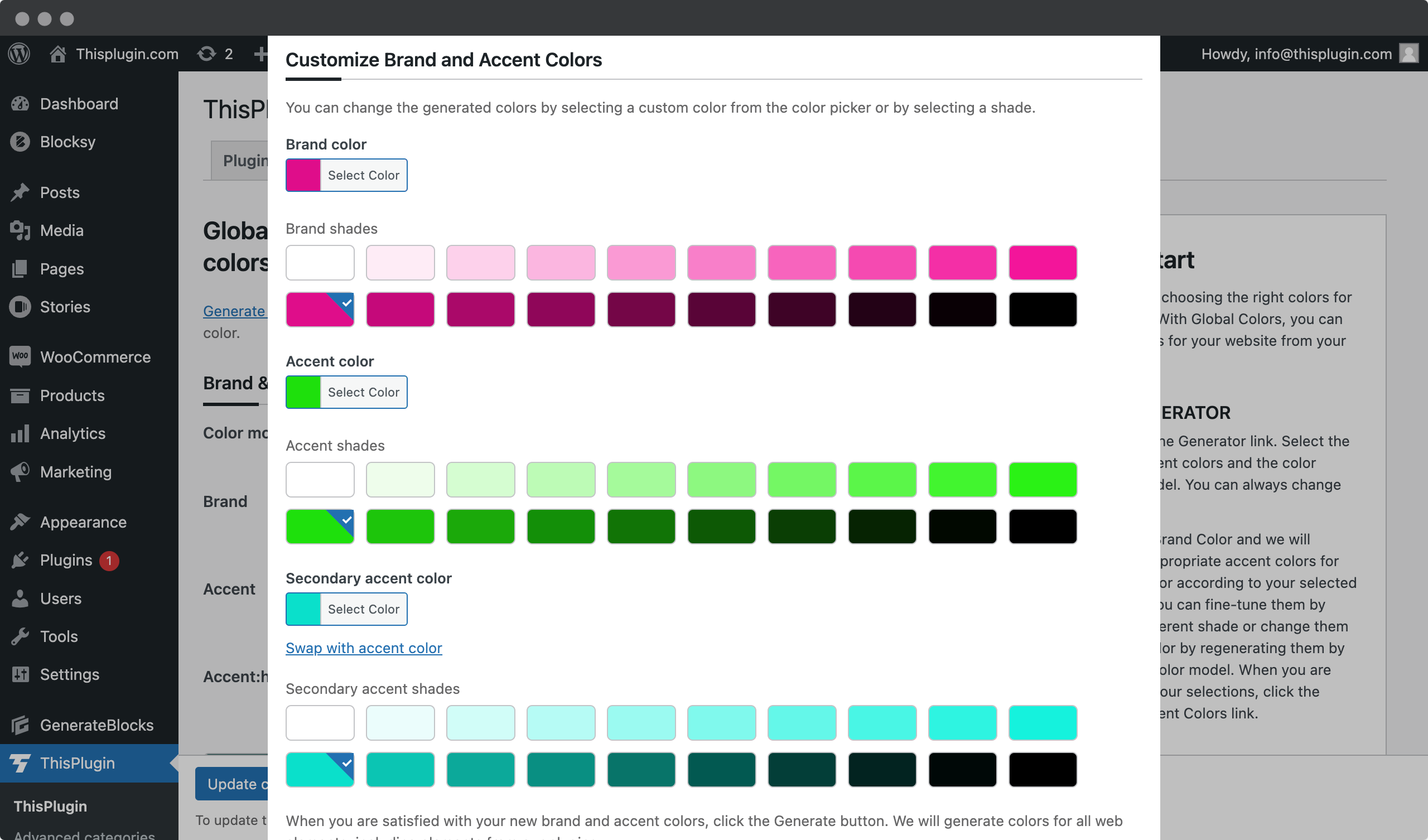
While we recommend less contrasting shades for brand colors, more contrasting shades are used for color accents. If you are not satisfied with the generated accents, you can always change the base color or even return to the generator. With 2 accents, you can also change the order of the generated accents using the swap feature.
When you are satisfied with the selection, you can proceed to generate all web elements by clicking the Generate Element Colors button.
Colors of web elements
The Element Color Generator will generate all the colors you need for your project. From essentials that will be completely sufficient for beginning web designers to advanced options for experts.
What elements do you get color recommendations for?
- Primary, secondary and disabled buttons
- Headings, text and hyperlinks
- Element borders
- Background elements
- Semantic colors for states
- Element gradients
- Element shadows
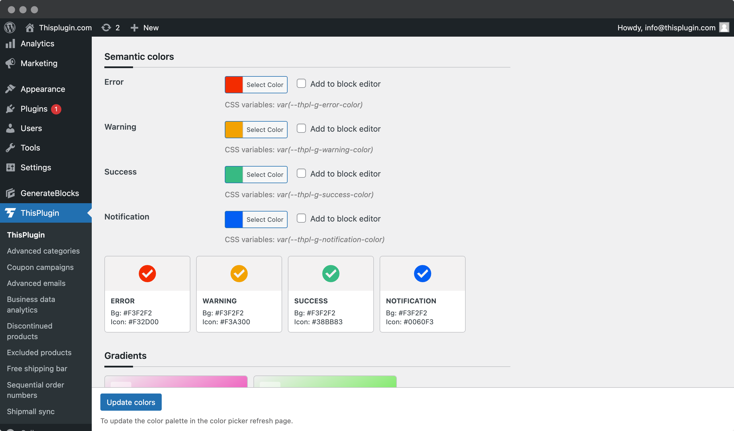
All element colors can be further modified to suit the nature of your project. In addition, we have made it easier for you to select essential colors with the Select Essentials feature. After all, having so many color combinations and options is not for everyone.
Editing and customizing colors
You can easily customize the colors. Just click on the color itself and edit it, or choose a different saturation.
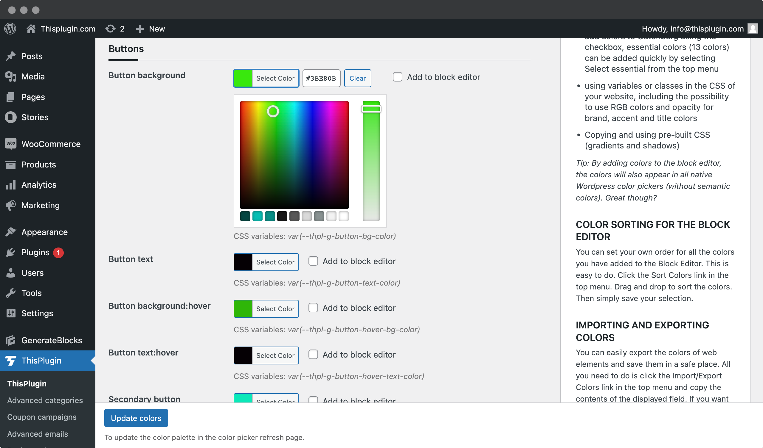
For elements such as gradients and shadows, you can also set some of their other properties in the Global settings, such as the direction of gradients and the stop positions of colors, horizontal and vertical offsets, and blur and spread for shadows.
If you want to change one of the basic colors and you have not yet adjusted the colors of the individual elements, we recommend that you open the generator again and simply regenerate the colors. This way you will get all the elements with the new colors without having to change them manually.
Contrast ratio
For most essential elements, for which accessibility must also be addressed, we will offer you an automatic contrast ratio calculation according to the WCAG 2.0 standard.
This mainly concerns the following elements:
- buttons
- headlines, texts, links on various neutral and branded backgrounds
- borders of elements – especially borders of form fields
Calculating the contrast ratio directly on the elements saves you a lot of time and reduces the number of tools you need to use when designing for accessibility. It also allows you to immediately decide and adjust low-contrast elements to make them as accessible as possible.
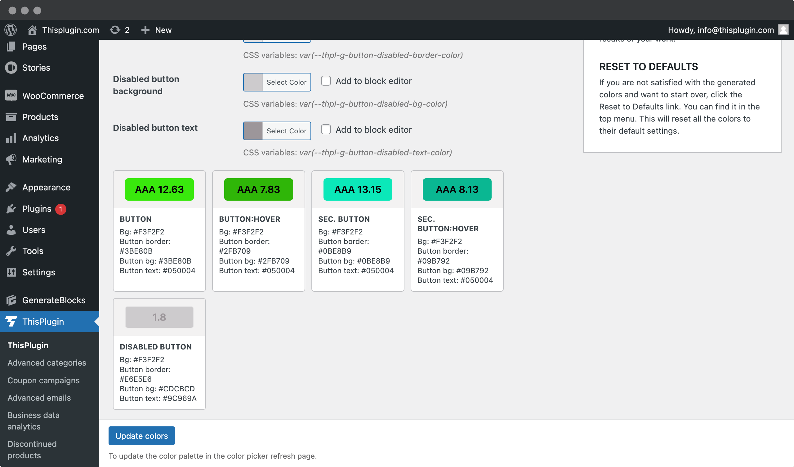
For text elements, we recommend a minimum contrast of AA. For UI elements, we recommend a contrast of at least 3:1.
Using element colors
Designing colors and all web elements, as well as evaluating their contrast, saves a lot of time. But it wouldn’t make sense if Global Colors didn’t allow you to use the obtained colors directly when creating your Wordpress project.
That is why we have added the following important features to Global Colors:
- The ability to easily add all or only essential colors to the Gutenberg block editor, as well as to the native Wordpress color picker.
- Using colors through variables and classes in your project’s CSS or in other builders like Gutenberg that can work with variables (Bricks Builder, Oxygen Builder, Breakdance, etc.)
- The ability to directly copy CSS gradients and shadows and add them to your own classes.
Adding colors to the block editor and color picker
Adding colors to the Gutenberg block editor is easy and very fast. Just select the colors you want to use in the Gutenberg color palettes using the “Add to block editor” and save your selection. We’ve made this process even easier for beginners with the ability to select all the essential colors with one click and add them using the Save Colors button.
Of course, you can also remove colors from the Gutenberg palettes in the same way.
At the same time, we automatically add essential colors to the native Wordpress color picker to make it easier for you to manage colors in those parts of Wordpress where it is not possible to use color palettes (especially in third-party plugins).
In the native Wodpress color picker, we add brand color, accents, color of headings and texts, border color on light background, border color of form fields on light background, light background and white background.
Due to the limited space of the widget, these colors cannot be expanded.
Using variables and classes
Just adding colors to the block editor and native color picker is not enough. Using the CSS variables we generate for colors, you can easily add colors to any tool – theme or plugin – that supports variables. Including various page builders such as Bricks Builder, Oxygen Builder or Breakdance.
We generate CSS variables for colors defined by HEX, RGB, and in the case of esential colors – brand, accents and headings, with the option to set opacity for RGB colors. You can use this for example in gradient settings. It is enough if you add multiples of the value ten instead of XX to a variable such as var(–thpl-g-accent-color-rgba-XX).
In addition to variables, we also offer CSS classes for some elements, such as gradients and shadows.
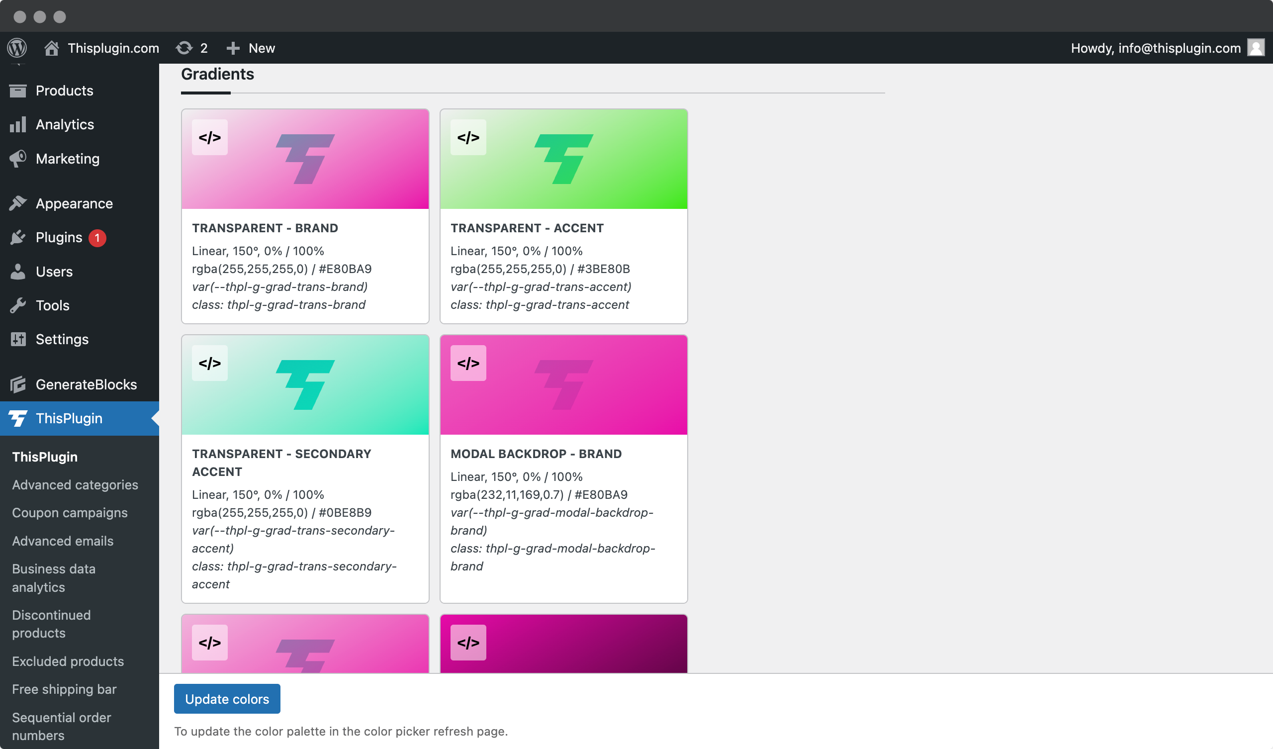
Variables cannot yet be used in Elementor Builder and FSE themes. Full support for variables has not yet been added to these tools.
Sorting colors in color palettes
By default, all colors are added to the Block Editor in the order in which they appear on the page.
If you want to change the order in which the colors are added, just click on the Sort Colors link in the top menu and drag and drop the order of the colors. After that, just save the selection by clicking the Update Colors button in the modal window.
Exporting and importing colors
You can easily transfer all of the element colors you get or set between your own or your client’s projects.
Simply click on the Import and Export Colors link in the top menu and copy the JSON content from the field. Then, on another project, paste the JSON content into this field and click the Save button.
This is also an easy way to create different color themes and save them for future use.
Reset to defaults
If for any reason you wish to return to the original default colors, simply click on the Reset to Defaults link in the top menu. This will restore our default colors.
Need help?
Submit a ticket
Need help setting up the plugin? Submit a ticket in our support center and we will help you.
Feature request
Didn't find the feature you were looking for? Send us a request and we will consider adding it.
Changelog
The changelog lists all the new features, enhancements and fixes already released.
Roadmap
In the roadmap you will find a list of all planned or user-proposed features.