Search in documentation
Colors
Choosing the right colors for your next WordPress project can be difficult. It’s easy to get overwhelmed by the endless possibilities and end up with a design that’s just ‘meh’. We take color selection seriously – so much so that we’ve developed a guide to picking the perfect hues for your Wordpress project! Believe it or not, our simple process guarantees you’ll have a professional, eye-catching site in no time. Who knew finding the right colors could be so easy? Let us show you how.
So you want to create a great website, but you don’t know where to start when it comes to choosing colors? Fear not! We are here to help you make your site stand out from the crowd – without wasting hours trying different color combinations. We understand the importance of creating striking visuals that accurately represent your brand. With that in mind, let’s explore exactly what goes into creating a beautiful palette for any Wordpress project.
From subtle pastels to bold primaries and everything in between, there are tons of options available online when it comes to choosing colors for web designs. But how do you choose the best ones? Stay tuned as we walk you through their tried-and-true method for making sure each shade works perfectly together. Are you ready? Let’s get started!
Visual design principles
When designing in WordPress, it’s important to understand and apply visual design principles. These guidelines can help you create an aesthetically pleasing project that stands out from the rest. Color is one of the most powerful elements in a design, so adhering to basic color principles will set your project apart from others.
To get started on the right foot, you should familiarize yourself with the basics of design principles. This includes understanding how colors interact with each other, their symbolism and meaning, and the types of emotions they evoke. In addition, explore the basics of color theory, such as the color wheel, hues and shades, saturation levels, etc., to get a better understanding of how to use them effectively in your designs.
Once you’re comfortable with visual principles and have spent some time researching available tools such as Pantone or Adobe Color Wheel, you’re ready to start selecting colors for your next project. With all this knowledge under your belt, let’s continue our journey into the world of color wheel basics!
Color wheel basics
Did you know that up to 90% of our decisions are influenced by color? That’s why it’s important for businesses and designers alike to understand the basics of the color wheel. We are here to share some key tips for choosing colors for your next project.
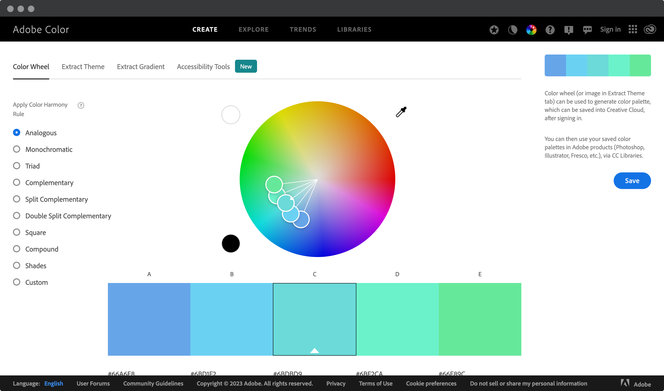
First, familiarize yourself with the basics of color theory: hue, saturation, tint, shade, and tone. With these principles in mind, explore basic color relationships such as analogous or complementary colors. These will help set the tone for your project and create an overall aesthetic appeal.
In this video, you will learn the basics of color theory and how to choose colors that work well together: the color wheel, color harmonies, and color palettes.
Next, explore different types of color combinations, such as monochromatic or triadic palettes. You can also consider contrast schemes or experiment with accent colors to add visual interest. Keep in mind that your choices should be based on what best fits the mood of your project, while still maintaining a modern feel.
Understanding how hues work together is important when deciding which colors work best for your WordPress website or application. Now let’s move on to understanding how different colors evoke certain emotions – we’ll dive deeper into color theory and psychology!
Color theory and psychology
When it comes to designing a WordPress project, colors are an important part of the overall look and feel. Color theory and psychology both play a large role in how viewers perceive your design. To create the best visuals for your next project, you’ll want to understand the symbolism, meaning, and emotion of color.
Learn how the basics of color theory can take your project to the next level! Watch this video to learn everything you need to know.
It’s important to use colors that complement each other while still conveying what you’re trying to say. Warm tones like reds, oranges, and yellows can be used to evoke feelings of passion or energy; cool blues and greens can evoke calm or serenity; whites and grays can evoke minimalism or modernity. Knowing which colors fall into which categories is key to creating a successful design that speaks directly to your audience.
Did you know that people make decisions within 90 seconds of their first interaction with a website or product? You probably never realized how important your color palette is. But how do you know which colors are right for you? Watch this video to find out.
Once you have an idea of which colors will help tell your story most effectively, consider how they will work together on screen. The hues you choose should work together harmoniously without clashing too much – it’s all about striking a balance between complementary tones that don’t overwhelm each other. With thoughtful consideration in these areas, you’ll soon have a stunning design that will resonate with viewers more than ever before! As we move forward with choosing a color scheme for our next Wordpress project…
Choosing a color scheme
Choosing the right color scheme for your project can be tricky. It’s not as simple as picking a shade and calling it a day-there’s a lot of thought that goes into creating an effective palette. Think of it like baking a cake; you need to mix different ingredients together to get the desired result. In this case, those ingredients are colors!
When it comes to choosing a color scheme, inspiration is key. To start brainstorming ideas, consider the type of website or project you’re designing. Are you working on something professional? Something fun? Or perhaps something more creative? Once you’ve decided what kind of vibe you want your project to have, look around for sources of color inspiration. This could mean browsing photos online, visiting museums and art galleries, or simply observing the everyday life around you.
Once armed with some fresh ideas and concepts, create several combinations using different shades of each chosen hue. Remember that in most cases, less is more when it comes to color choices – try to stick to three main colors, plus accent shades as needed.
Make sure these combinations complement each other well by considering how warm or cool they appear and whether there are any clashing undertones between them all. You’ll have created a stunningly unique yet cohesive color palette perfect for your WordPress project!
Monochromatic colors
Monochromatic colors are a great choice for your next WordPress project. They create a consistent look, allowing you to have a single color scheme that is consistent throughout the design.
To learn more about monochromatic colors, we recommend watching this video.
This type of palette also offers a lot of flexibility with different hue variations and shades within the same hue range. With monochromatic colors, you can still be creative while creating an aesthetically pleasing site.
When choosing a monochromatic palette, it’s important to consider how each shade will work together in harmony. Using too many similar colors can make the overall design look washed out or muddy.
It’s best to stick with one main color as a base, and then use different hues and shades around it for contrast. You can even add subtle accents of other colors if you like-just keep them minimal so they don’t overwhelm the primary color.
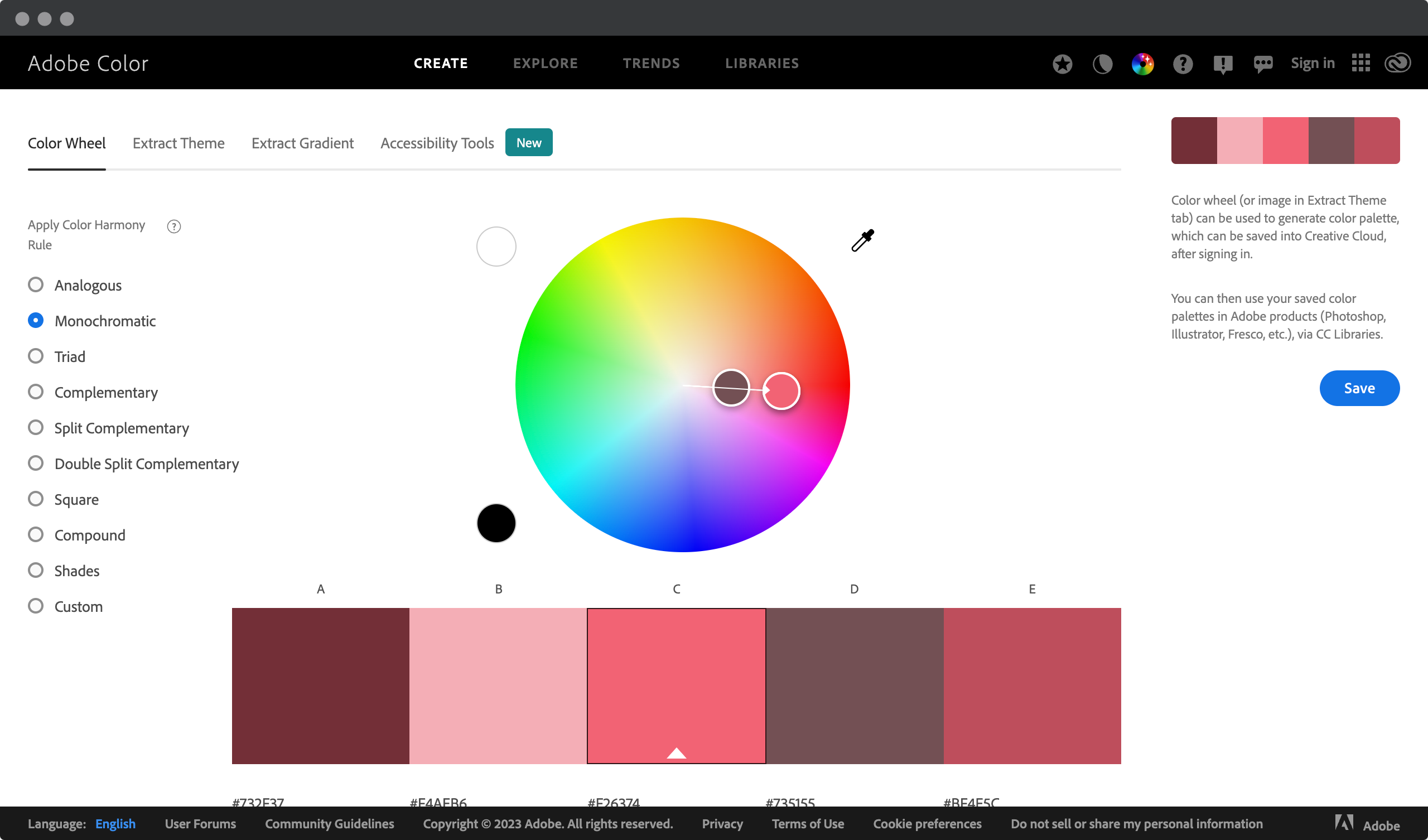
By using a monochromatic color scheme, you’ll be able to easily incorporate cohesion into your web design without sacrificing creativity or style. Allowing yourself some freedom with this approach allows you to explore interesting ways to visually express your message without overwhelming the viewer’s eyes. Ready to take the next step? Let’s talk analogous color!
Analogous colors
Imagine a beautiful painting that has been carefully crafted with colors and shades that complement each other to create a stunning work of art. This is analogous color design in action – when colors are chosen from adjacent hues on the color wheel, creating an analogous color palette that works together harmoniously.
Analogous colors are among the most popular schemes. Learn more in Riereate’s video.
Analogous colors can be used for any WordPress project, as they provide a calming effect by creating an aesthetically pleasing atmosphere. When choosing colors for your next WordPress project, consider using an analogous color scheme.
This type of scheme consists of three colors that sit side by side on the hue circle, such as blue, light blue, and turquoise, or green, yellow-green, and yellow. By incorporating these analogous colors into the design and layout of your website, you will evoke feelings of unity, balance, and harmony in your viewers.
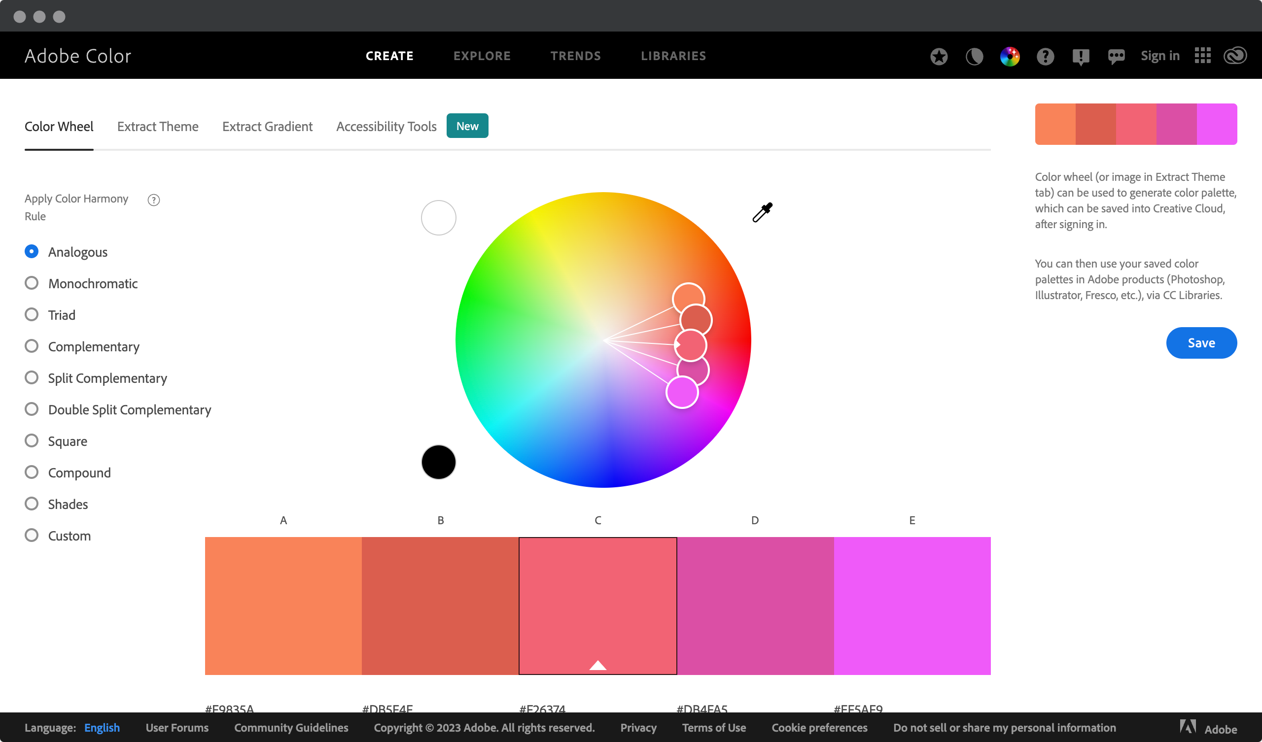
You can also add depth to your design by combining two different values of a color within an analogous palette. For example, using both a dark navy blue and a lighter sky blue creates contrast while maintaining consistency throughout the page design. Experimentation is key when it comes to finding the right combination of analogous colors for your WordPress project, so why not try some unique analogous color combinations today?
By exploring how analogous colors work together, you can bring life to your designs while staying true to the core concept of your website’s mission statement. Using subtle nuances like this helps to create a sense of cohesiveness between visual elements without being too distracting or clashing too much with text or images on the same page. As we explore complementary colors next, remember how powerful, yet delicate, adding subtlety through analogousy can be in our projects!
Complementary colors
When it comes to choosing colors for your next WordPress project, complementary colors can be a great starting point. Complementary colors are two hues that are directly opposite each other on the color wheel. This type of color combination provides the highest contrast and creates a vibrant look when used together. To create an effective complementary color pairing, try to use similar hues or tones from both sides of the spectrum – this will help keep your design fresh and modern.
This video explains what complementary colors are. You will also learn why they are used and how they can be used to create contrast and shadows.
Don’t forget about hue variations either! Differentiating between light and dark tones within complementary colors adds dimension and depth to your website layout. When creating a balanced design with complementary colors, experiment with different hues to find what works best for you. Experimenting with tools such as Adobe Color can also help you find the right balance between light and dark tones.
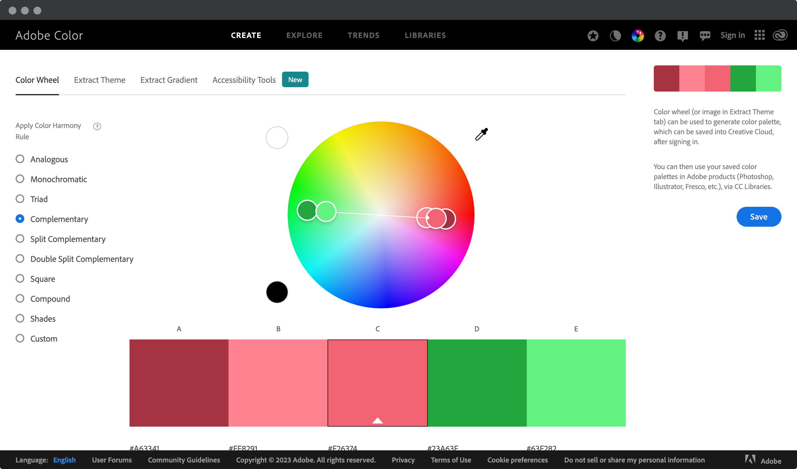
To bring out the complementary tones even more, adding neutral accents such as black or white to the mix can work wonders to tie everything together harmoniously. Neutral elements add visual interest while allowing all other aspects of your design to stand out without competing with each other. With careful consideration of these points, you’ll be well on your way to creating a dynamic yet cohesive WordPress project that stands out from the crowd!
Split-complementary colors
Did you know that 90% of the world’s top WordPress sites use split-complementary colors in their designs? Split-complementary colors are an easy and powerful way to give your website a vibrant, modern look. We recommend this type of color scheme for creating eye-catching visuals.
Split complementary colors consist of three hues:
- dominant hue
- two additional hues on either side of its complement (opposite) on the color wheel
This creates a balanced palette with lots of contrast, but without clashing hues or clashing combinations. For example, combining blue, yellow, and orange can create a bold yet harmonious effect. The advantage of this type of combination is that it allows you to experiment with different shades and tones while still maintaining balance within the overall composition.
Split complementary colors are a type of color harmony. The split complementary is a variation of the complementary color scheme. In this video you will learn all the necessary details about this scheme.
When choosing split complementary colors for your next project, consider both the primary and secondary hues. Make sure they work together to bring out the best in each other. You can also combine different shades within these hues, or even add neutrals to the mix for added depth and texture.
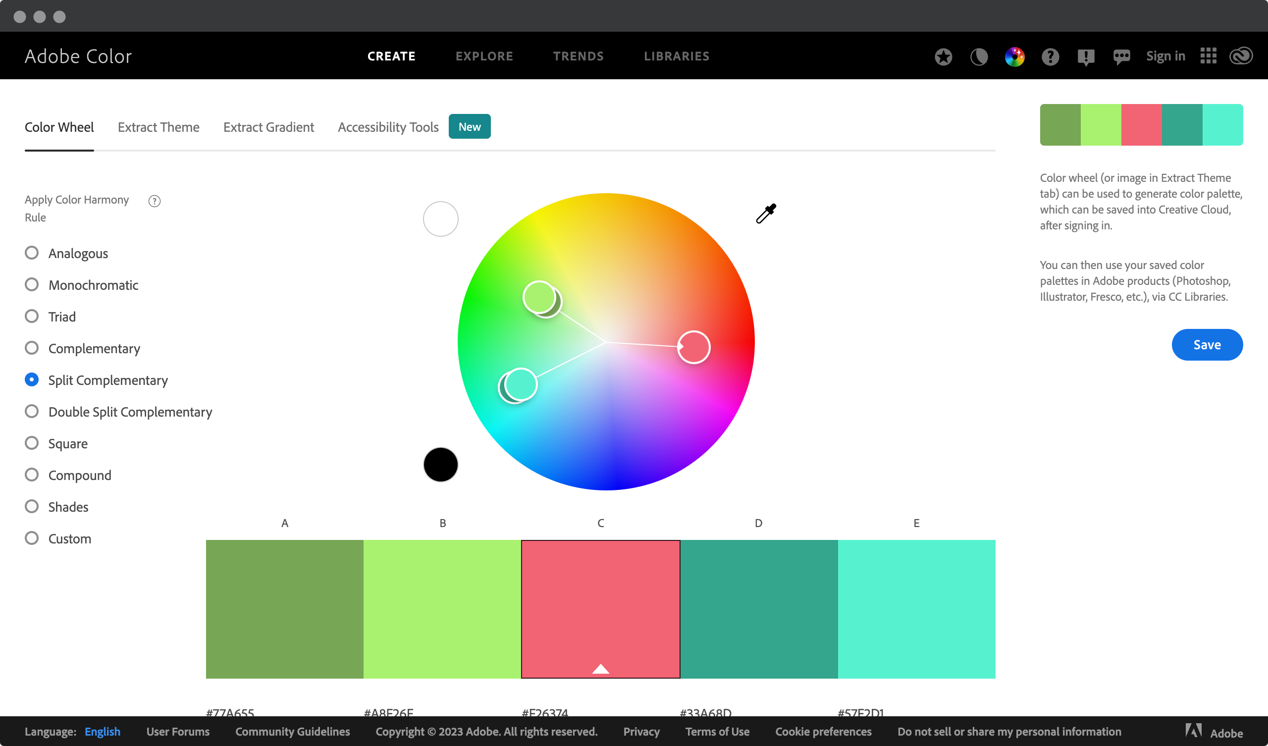
Experimenting with different palettes is key to finding the perfect combination for your site’s aesthetic! With split complementary colors, the possibilities for getting creative are endless – so don’t be afraid to explore them all!
Triadic colors
When it comes to choosing colors for your next WordPress project, you can’t go wrong with triadic color schemes. A triadic color scheme consists of three hues that are evenly spaced around the color wheel. When used correctly, a triadic color combination creates an eye-catching and visually pleasing design.
Triadic color theory states that when these three colors are combined harmoniously, they create a vibrant yet balanced look. With this approach, you’ll be able to wow your audience and get them to pay attention to your website or blog in no time!
Triadic colors are three colors equally spaced around the color wheel. In this video you will learn how to find and use triadic colors.
Creating a successful triadic color scheme requires more than just picking random colors from the wheel. You need to choose shades and tones within each hue that blend seamlessly together. This way, all the colors used in your WordPress project will complement each other perfectly. Once you have chosen the right combination of colors, try experimenting with different textures and adding accents with other neutral tones like black or white. Remember, there’s no limit to your creativity!
Using triadic colors can add dimension and depth to any WordPress design project. It allows designers to showcase their creativity while creating something unique that stands out from the competition. So don’t be afraid to play around until you find the perfect balance between the three hues – once you do, you’re sure to have a winning result!
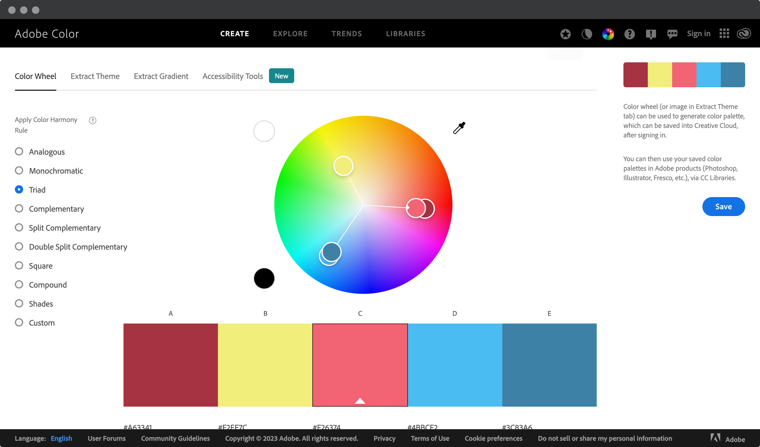
Ready to explore mixed colors? These unique combinations offer endless possibilities when it comes to creating stunning visual effects…
Compound colors
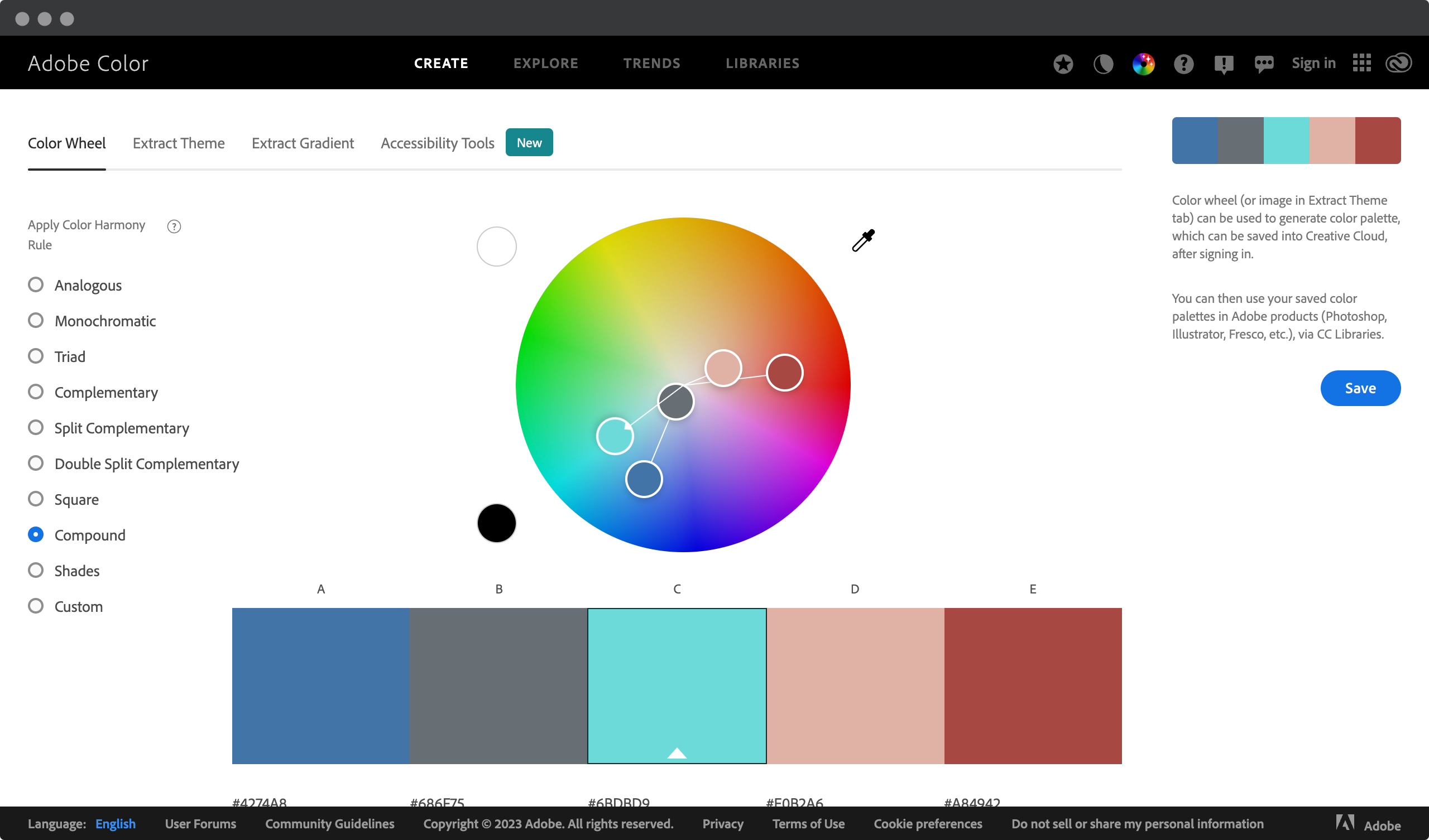
Compound Colors are an excellent way to create a visually appealing and dynamic website design. By combining multiple shades of the same hue, you can create a unique color combination that stands out from the crowd. Here’s what you need to know when using compound colors in your next WordPress project:
- Choose two or three contrasting colors for maximum visual impact.
- Make sure each color has different hues and tones so they don’t clash.
- Incorporate multicolor schemes into your design by mixing complementary primary and secondary colors.
- Experiment with different combinations until you find the perfect balance between contrast and harmony.
If you are looking for an easy color management tool for your WordPress project, read on. ThisPlugin Manager is an excellent tool for selecting color schemes for your WordPress project. With its intuitive interface and user-friendly features, it provides a seamless experience for anyone looking to generate the perfect color scheme.
It also offers the ability to customize colors, allowing you to create a unique and personalized look for your website. Whether you’re a beginner or an experienced user, ThisPlugin Manager is the ideal tool for selecting color schemes that will help your website stand out and look its best.
Whether you use ThisPlugin Manager or another tool for these strategies, they’ll help you create stunning visuals that will grab visitors’ attention and keep them engaged with your content. To further enhance the look of your site, consider experimenting with shades, tones, and hues to add depth and complexity.
Shades, tints, and hues
When it comes to web design, one of the most important aspects is color. Choosing the right color scheme can make or break the design of your website. But how do you go about choosing the right colors? One way is to understand the concepts of shades, tones, and hues.
Although this is hand drawing and not web design, the theory is the same. In this video you will see perfect examples of what shades, tints, and hues are.
Shades
Shades are created by adding black to a color, which darkens the original color. For example, if you start with a bright red color and add black to it, you get a darker shade of red. Shades are often used to create depth and contrast in a design. Darker shades can also give a design a more serious or formal feel.
Tints
Tints are created by adding white to a color, which lightens the original color. For example, if you start with a bright blue color and add white to it, you get a lighter tint of blue. Tints are often used to create a softer, more delicate look in a design. Lighter tints can also make a design feel more playful and whimsical.
Hues
Hues refer to the purest form of a color, without any black or white added to it. For example, red is a hue. Hues can be modified by changing their saturation (the intensity of the color) and their brightness (how light or dark the color is). The saturation can be increased to create a more vibrant, bold look, or decreased to create a more subdued, muted look. The brightness can be increased to make a color appear lighter, or decreased to make it appear darker.
Selecting the right background color
Recent studies show that color selection is the most overlooked element of design, yet it has a huge impact on how users engage with an interface. To get started choosing background colors for your WordPress project, let’s take a look at some popular options:
| Option | Description | Hex Code |
| White | Crisp and clean in appearance; stands out against other colors for highlighting text or images; adds brightness to webpages. | #FFFFFF |
| Light Gray | Offers subtle contrast between elements while still providing enough visual interest; creates openness; modern feel. | #F5F5F5 |
| Dark Gray | Creates more depth than white backgrounds without being too harsh like black; provides focus & balance to content areas. | #333333 |
| Black | Often used as a secondary highlight color when paired with lighter shades; great for emphasizing headlines or sections. | #000000 |
Choosing the right background color depends on the overall vision you have for your WordPress project. If you want something light and airy, opt for whites and light grays. Darker shades like dark gray and black can add sophistication if that’s what you’re looking for.
It all comes down to personal preference, but make sure that whatever you choose does not detract from the important information within your website layout. Now, let’s discuss the different color formats available for customizing Wordpress projects!
Color formats for WordPress projects
When it comes to creating a color scheme for your WordPress project, there are several formats you can use. It’s important to consider which one works best to create an engaging visual experience that stands out and is memorable.
One of the most popular color format options is to use monochromatic colors-choosing shades within the same hue or tone. This tends to be appealing because it creates a sense of calm and cohesion throughout the site design.
How do I use a color palette? How many colors should I use? How do I know if my colors look good together? Creating a color palette is the first step, but knowing how to use it is another. This video shows a handy color trick known as the 60-30-10 rule.
You can also opt for contrasting colors, such as complementary pairs (e.g., blue & orange), analogous triads (e.g., yellow-green, green & blue-green), or split complementary pairs (e.g., red-orange, purple & yellow). Contrasting colors tend to make sites feel vibrant and energetic while still remaining visually balanced.
For more adventurous designs, consider tertiary or even quaternary palettes, which consist of multiple hues ranging from warm to cool. Used correctly, they can help create stunning visuals that engage visitors on any device screen size by allowing them to explore every corner of your site’s interface. However, with this type of approach, you need to pay special attention to your color choices to avoid overwhelming users with too much information at once!
Now that we’ve gone over some different Wordpress color formats, let’s move on to testing & finalizing your color scheme…
Testing & finalizing your color scheme
Testing and finalizing your color scheme is an essential step when working on a WordPress project. It’s important to ensure that the design palette you choose is both aesthetically pleasing and harmonious with the theme of the website. When creating a great looking website, there are a few key steps to follow to get it just right.
First, make sure that all of the colors in the color palette complement and balance each other. This can be done by testing different combinations of shades and tones before settling on a particular color scheme. This will help you determine which colors work best together for maximum visual impact. Also, consider how your chosen colors may vary between devices such as phones and laptops – different screen sizes require different adjustments!
Once you’re happy with your color choices, it’s time to see them in action! Try using mockups or dummy content so you can see exactly how they look when used in context within your site design. Don’t forget to evaluate how they interact with typographic elements as well – these little details can often make or break a design choice. Armed with this knowledge, it should be much easier to tweak each nuance until you find the perfect color combination for your WordPress project.
Color management with ThisPlugin Manager
When it comes to color management for your website design, choosing the right color scheme can be overwhelming and difficult. You may struggle with understanding the psychology of colors, their appropriate combinations, and which hues you need on which elements of your site. However, with ThisPlugin Manager‘s color management features, you can easily set the global colors of your website, regardless of your experience. This will inspire you and save you a lot of time and mistakes.
ThisPlugin Manager offers powerful tools for generating and managing the colors of your WordPress project. In this video, you will learn all the necessary features that will make your life easier.
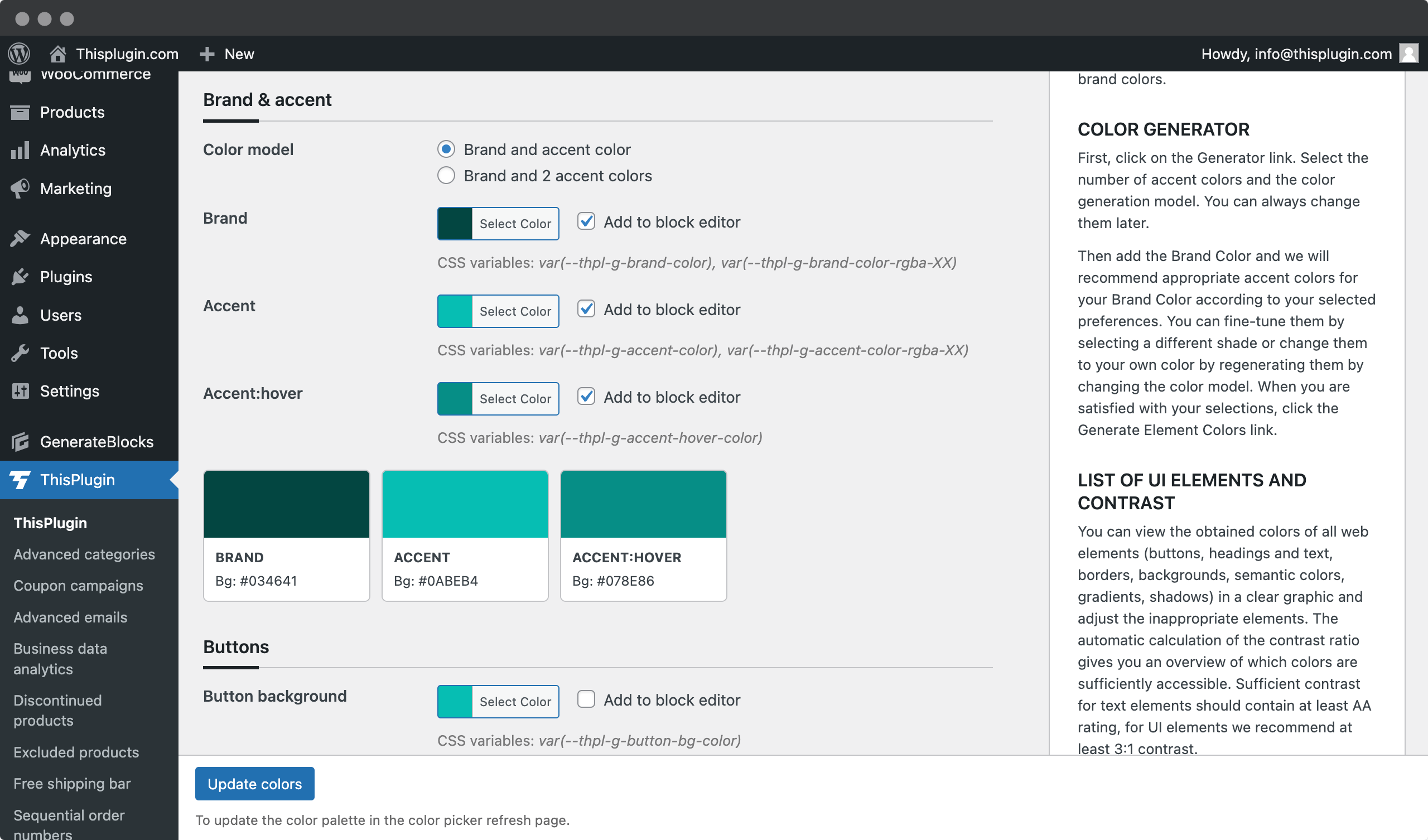
With the Global Colors tool you can choose a basic brand color with one click and the rest of the color palette will be generated automatically. This means you do not have to worry about choosing the right colors, as the generated colors are based on proven schemes and combinations. In addition, the tool offers a range of options, including one or two accent colors, split complementary, analogous, and triadic color combinations, allowing you to choose the scheme that best suits your project.
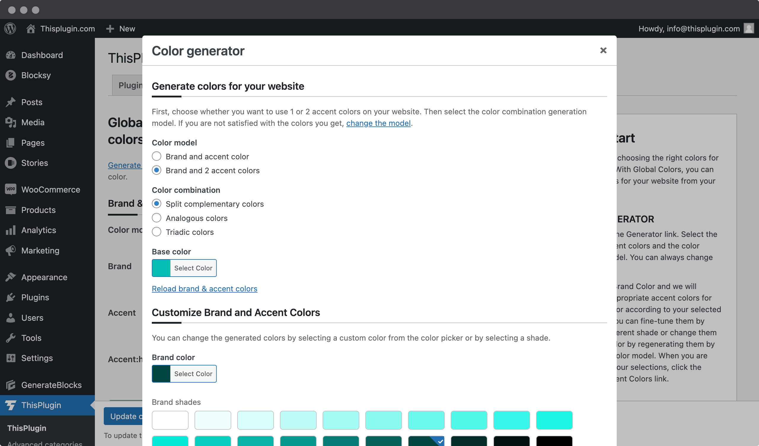
You can easily add your own colors in the block editor with a single click, saving your time and effort. You can add only essential colors or manually select the ones you need and then update your palette with a single click. In addition, you can drag and drop colors to change their order in block editor for greater flexibility and control.
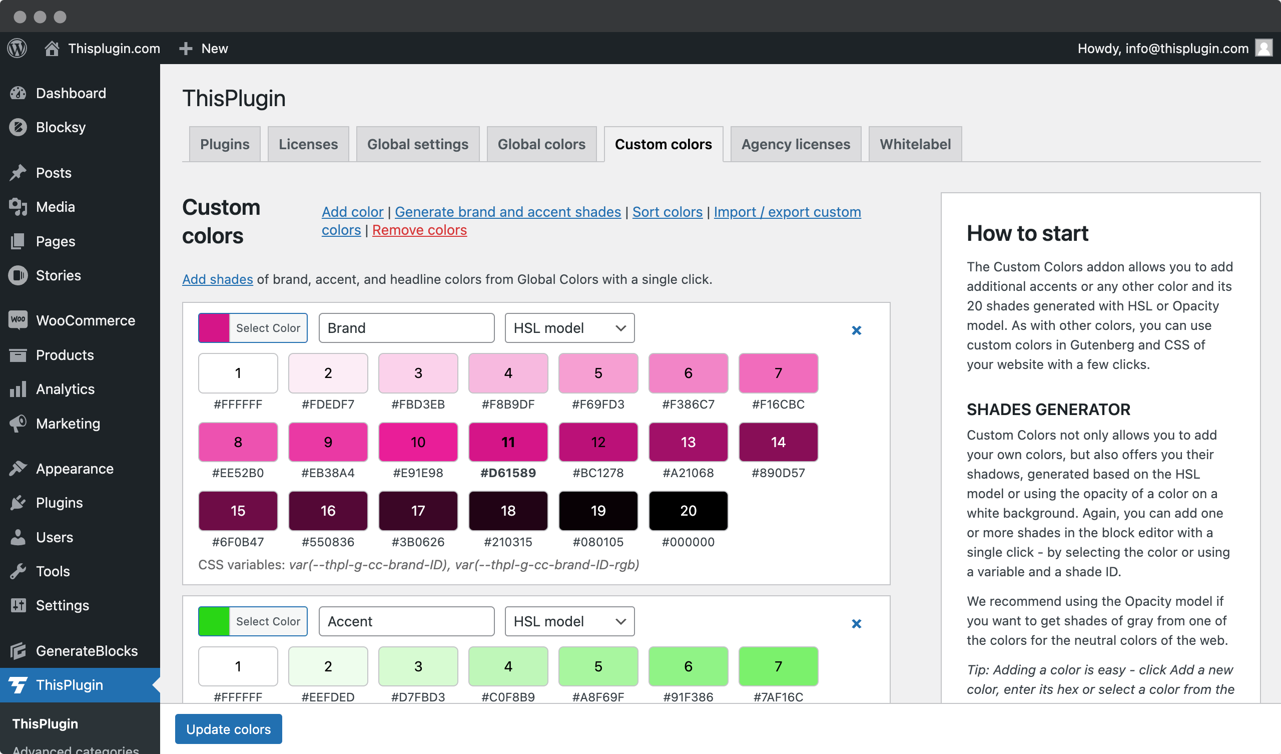
If you need even more customization, you can use the Custom Colors add-on to add an unlimited number of new colors to your palette. You can generate them from the base palette or add your own, and adjust their hues based on the HSL or Opacity model. This gives you more flexibility and control over the color scheme, ensuring that it is tailored to the specific needs of your project.
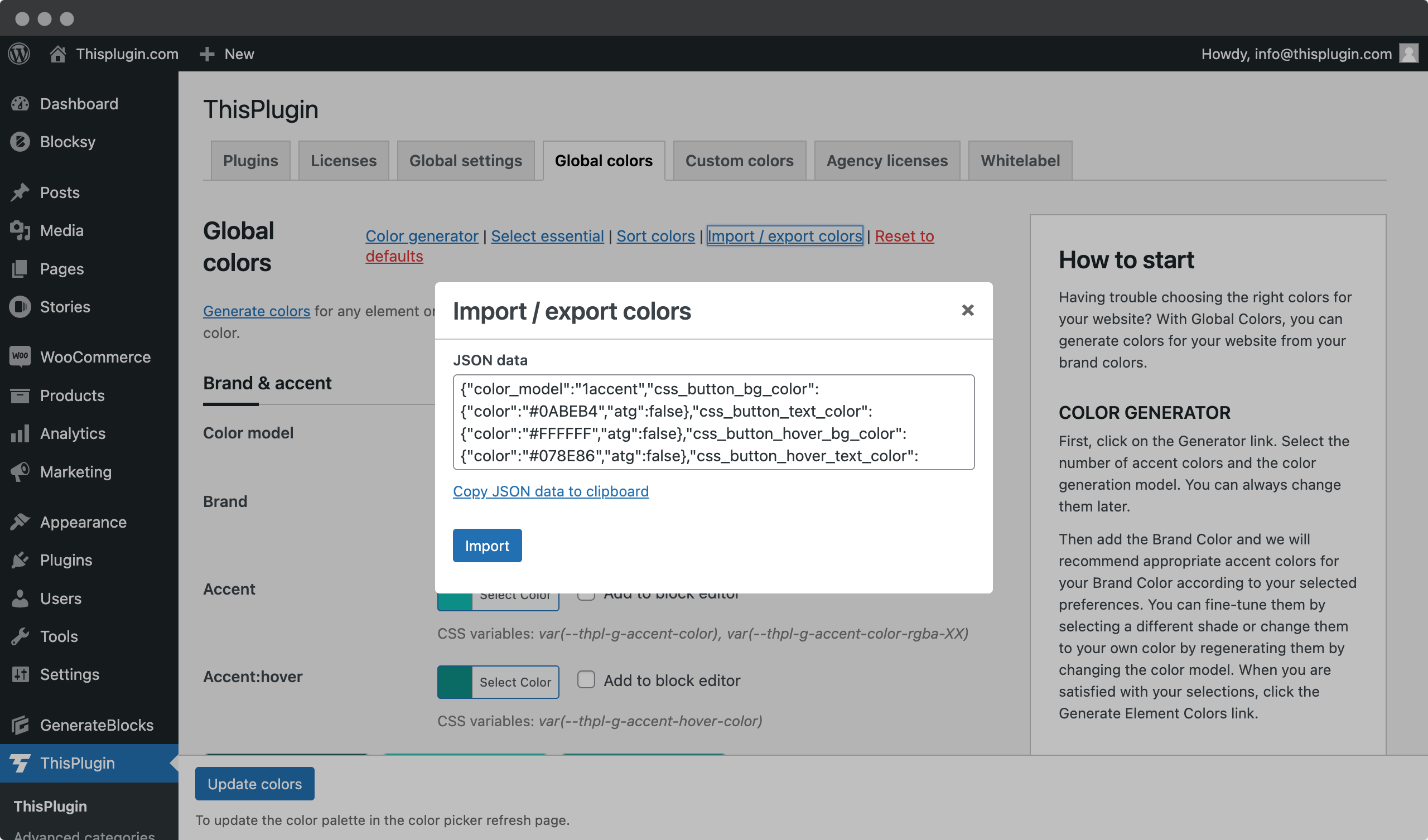
Importing and exporting color schemes is another key feature of ThisPlugin Manager. You can easily transfer preferred color schemes between different sites or projects, saving time and ensuring consistency in branding and design. You can import and export palettes for both global and custom colors with just one click.
ThisPlugin Manager’s color management tools make it easy to find the right colors for your project, regardless of your level of experience with color theory. By providing a range of options and flexibility, you can create a color scheme tailored to your specific needs and preferences. And because the tool is completely free, there is no risk in giving it a try and seeing how it can improve your color management process.
Conclusion
It’s important to choose the right colors for your WordPress project so that it looks modern and professional. Color choices can make the difference between a successful website and one that doesn’t quite get the job done. We recommend taking the time to create a custom color scheme that works across all devices.
The best way to ensure consistent results is to research color theory and understand how different hues interact. In addition, use tools such as the Adobe Color Wheel or Coolors to experiment with different palettes until you find something that works for you. Finally, test your chosen color scheme on multiple screens before pushing it live to your website.
Overall, choosing an appropriate color palette for your next WordPress project requires thought and experimentation – but it’s worth the effort! With proper research and testing, you can curate vibrant visuals that truly represent your brand and engage viewers in meaningful ways.
Frequently asked questions
How do I know if I’m using the right colors for my project?
When choosing colors for your next project, it’s important to consider color compatibility. It can be difficult to choose a color palette that creates an aesthetically pleasing design while also being accessible to users on the web. So how do you know if you’re using the right colors?
There are several methods you can use when matching colors. One way is to check compatibility by looking at ready-made color palettes and seeing how they work together. This allows you to quickly see which hues work well together without having to spend time experimenting. You can then adjust these existing color combinations or add new ones of your own until you find what works best for your particular project.
Another option is to manually select each color to make sure it fits into the overall theme. This requires more work, however, as there are many factors such as contrast, saturation, and hue that need to be considered before deciding whether or not to use a particular hue. In addition, it’s important to remember that accessibility guidelines still need to be followed, so keep these in mind when choosing individual elements of your site’s design.
Ultimately, choosing the perfect set of complementary colors takes some trial and error, but with careful consideration of both aesthetics and usability standards, creating a beautiful user experience becomes much easier. With enough practice, choosing attractive yet functional colors for your projects will become second nature!
How do I adjust colors to work with different devices?
When creating a website, it’s important to ensure that colors are consistent across all devices. Color matching is essential for device compatibility, and color adjustments need to be made to provide the best user experience. As a WordPress design consultant, I am often asked how to adjust colors to work with different devices.
The key to successful color selection is understanding how colors look on different screens. It’s important to keep your audience in mind when making decisions about color consistency – if you’re targeting people who are more likely to use mobile or tablet devices than desktops, you may want to consider slightly lighter shades of certain colors because they’ll look better on these smaller screens.
You’ll also need to pay attention to the contrast between elements within your page; this will help ensure that text is easy to read and doesn’t blend in too much with background images or graphics. This can be achieved by playing around with brightness, hue, and saturation until you find something that works well across platforms. With a little experimentation and some research into current trends, you should have no problem finding the right combination of colors for your project!
What colors are best for a modern Wordpress website?
When it comes to creating a modern website, color selection is an integral part of the design process. Every pixel counts, and every shade can make or break your project. We are often asked: “What colors are best for a modern WordPress website? Well, this is something that requires careful consideration – but luckily, there are some simple tricks you can use to create an eye-catching palette.
From classic black and white combos to vibrant shades of blue, choosing the right web design colors is like painting with words – so let’s explore how to choose from the seemingly endless range of options! Whether you’re looking for inspiration or just a few tips on color selection, here’s what you need to know about creating the perfect WordPress color scheme for your next project.
First, understand that when it comes to modern website colors, less is more. You don’t have to go crazy with every shade under the sun to achieve an impressive look-instead, focus on building a cohesive color palette by limiting yourself to three primary colors and one or two accent colors. Done correctly, these carefully selected elements will harmonize and add depth and interest without overwhelming visitors.
In addition, think beyond flat blocks of solid color; using gradients and subtle textures within your chosen palette design can bring unique elements into play while adding further dimensionality.
Finally, remember that finding the ideal color combination isn’t always easy – but as long as you stay true to your vision and trust your instincts along the way, chances are you’ll end up with a stunning result! With a little creativity and following these basic color selection guidelines, anyone can create their own signature style that is sure to impress viewers around the globe.
How do I create my own color scheme?
Creating a custom color scheme for your next WordPress project can be daunting, but when done right, it can take an average website to the next level. Creating a unique and engaging color palette is key to standing out from the competition and creating a memorable experience for your audience.
When it comes to choosing color combinations that work together, there are several steps you should take to create a stunning color scheme. First, choose two or three colors that will serve as the backbone of your design – these colors should complement each other without competing. Once you have chosen these base colors, use them as inspiration for combining additional hues. You may also want to consult existing websites or images to get ideas about how certain colors might look together.
The idea behind creating a successful color scheme is to find harmony between different hues while still giving users something new and exciting to explore. In addition to combining complementary colors, experiment with texture and gradients to add depth and dimension to your design. It’s also important not to overlook small details like shadows and highlights – they can make all the difference when it comes to bringing your vision to life!
Ultimately, a strong knowledge of color theory will help you choose visually appealing options that fit well within the context of your WordPress project. Take some time before diving headfirst into implementation – think about the message you’re trying to convey through your color choices, and then strategize accordingly. With careful consideration and experimentation along the way, you’ll be able to create a beautiful custom color scheme that truly expresses who you are as a designer!
What is the best way to ensure that colors look consistent on different monitors?
When it comes to ensuring consistency with your colors across multiple devices, there are a few key steps you should take. Color accuracy and standards are essential to the success of any WordPress design project. We highly recommend familiarizing yourself with the best practices for creating multi-device color schemes that look good on all screens.
First, research the proper color standards that will help ensure maximum accuracy when designing projects. This includes understanding standard RGB and HEX values so that colors appear consistent across browsers and operating systems. Also, use tools such as Adobe Photoshop or Illustrator to adjust contrast levels and hue saturation to improve overall color vibrancy without sacrificing accuracy.
Finally, test how colors appear across platforms using specialized tools such as Browserstack or CrossBrowserTesting. These tools can also provide feedback on image resolution and other factors that affect how colors appear on different screen sizes and resolutions. Using these services will ensure that your site looks great no matter what device your viewers are using.
By following these tips, you’ll be able to create an attractive color scheme that stands out from the competition while maintaining an accurate representation no matter where people view it. With the right know-how, you can guarantee beautiful visuals with perfect color consistency every time!